Ayam Rempah Pedas Nampol
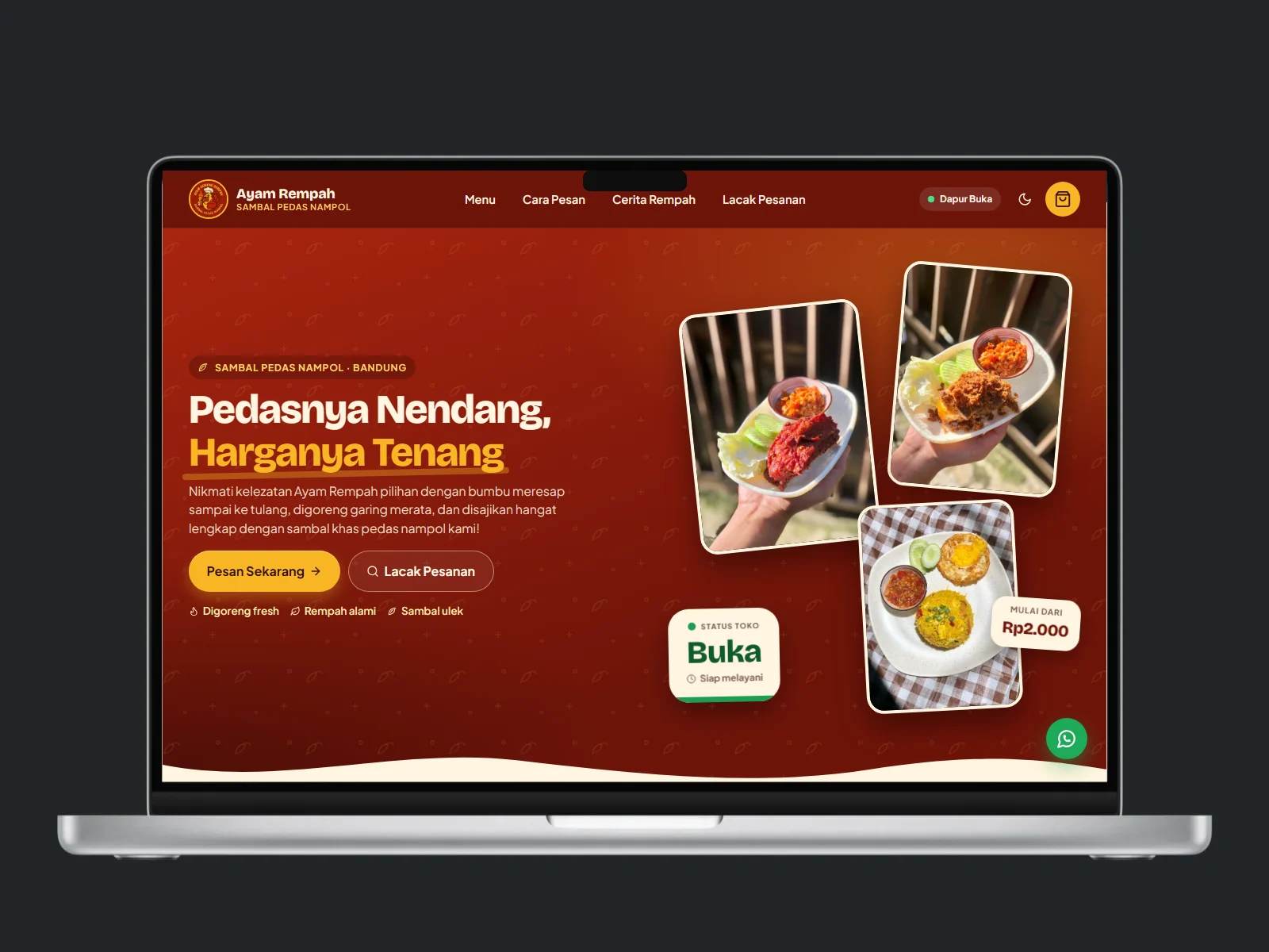
A revamp of the Ayam Rempah Pedas Nampol ordering website in Bandung: a tidy, phone-friendly new look, cart ordering, dynamic QRIS payment, order tracking, and a dashboard for orders, kitchen, menu, stock, and members.
Project Goal
Revamp the look and flow of the Ayam Rempah Pedas Nampol ordering website, a spiced fried chicken and hot sambal business in Bandung, so customers can easily pick a menu, pay by QRIS, and track their order, while the owner manages orders, kitchen, and stock from one dashboard.
What We Did
- Reworking the look around the red and gold brand identity from the logo, with a bottom navigation that is comfortable on phones
- Keeping the ordering flow customers already use and only tidying the visuals
- Ordering with a cart, delivery time or takeaway choice, and dynamic QRIS payment
- A dashboard for orders, the kitchen screen, menu, ingredient stock and recipes, members, and sales reports
- A hand-over package that is clean of credentials, with a web installer and documentation
- Installation on a shared database with a separate table prefix so nothing collides
Key Features
- A menu with variants, flavour labels, stock information, and photos automatically converted to WebP
- A cart saved on the device, a confirmation summary, and a choice of delivery time or takeaway
- Dynamic QRIS payment carrying the amount and order number, with a payment countdown
- Order tracking by order number or a dedicated link
- A kitchen screen with a new-order alarm that keeps sounding until marked done
- Optional members with points and a first-order discount
- Scheduled promo popups, an open or closed store status, and a floating WhatsApp button
- Structured SEO: Restaurant and menu data, an automatic sitemap, and a manifest so it can be added to the phone home screen
Outcome
A food ordering website that is tidier and easier for customers, with an unchanged ordering flow and store management centred in one dashboard.
Case Study
The existing ordering website worked, but its look was untidy and not fully comfortable on phones, even though most customers order from a phone.
The ordering flow was kept because customers already know it. What changed was the look: a red and gold palette from the logo, bottom navigation, an illustrated menu, and a clear QRIS payment page.
Customers can pick a menu, pay, and track an order through the same flow in a tidier look, while the owner manages everything from one dashboard.
Some of our work cannot be shown here because it is covered by a non-disclosure agreement or the client asked us to keep it private. We are happy to walk you through those projects directly.